Financijska agencija (FINA)
Visual Identity
The Problem
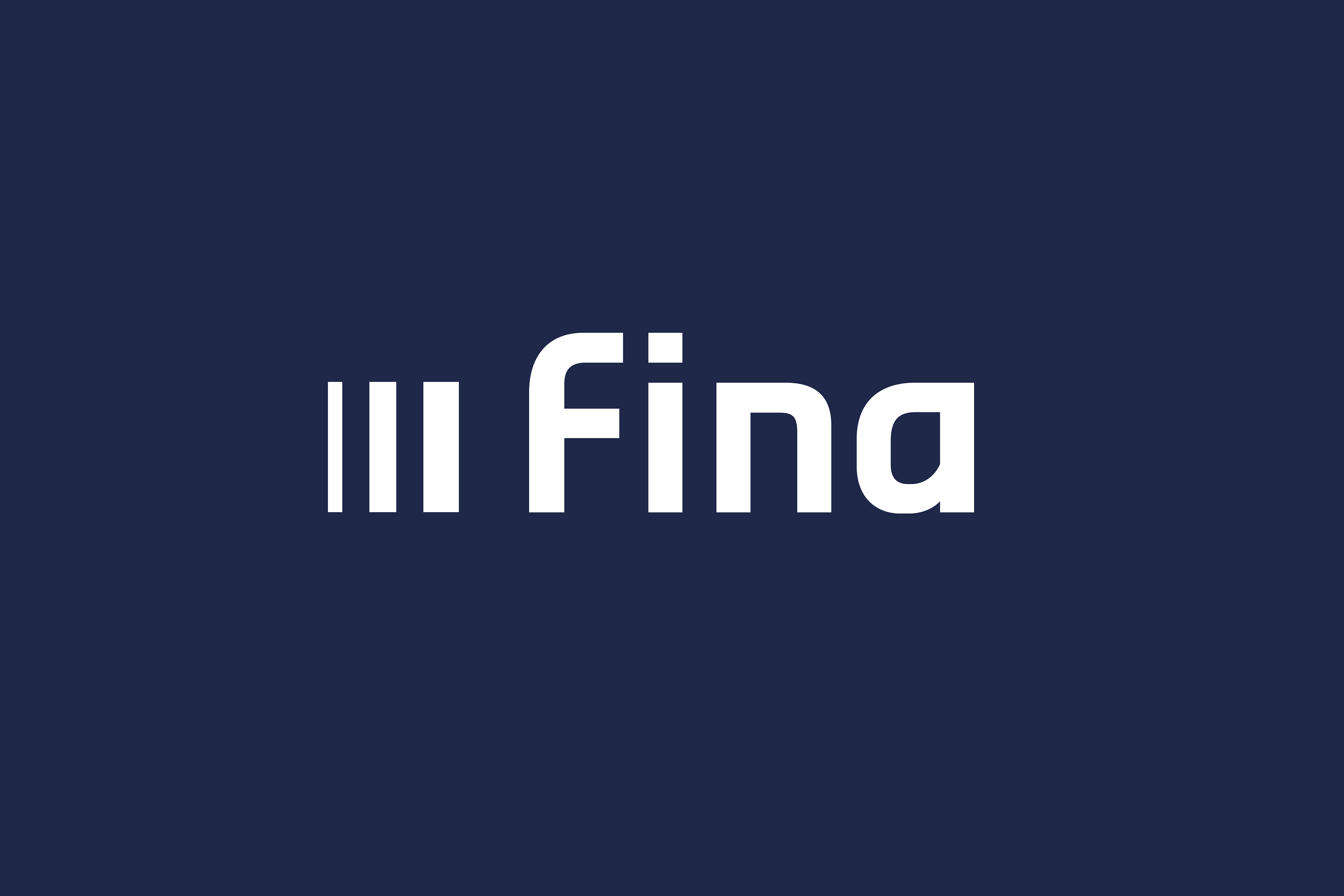
FINA, Croatia’s leading provider of financial and electronic services, relied on a logo unchanged for over twenty years. Its proportions were awkward, spacing inconsistent, and the letter a didn’t scale well. The brand felt dated and struggled to support FINA’s wide range of digital products.
A full redesign wasn’t an option, yet the visual system needed clarity, consistency and modern performance.
The Solution
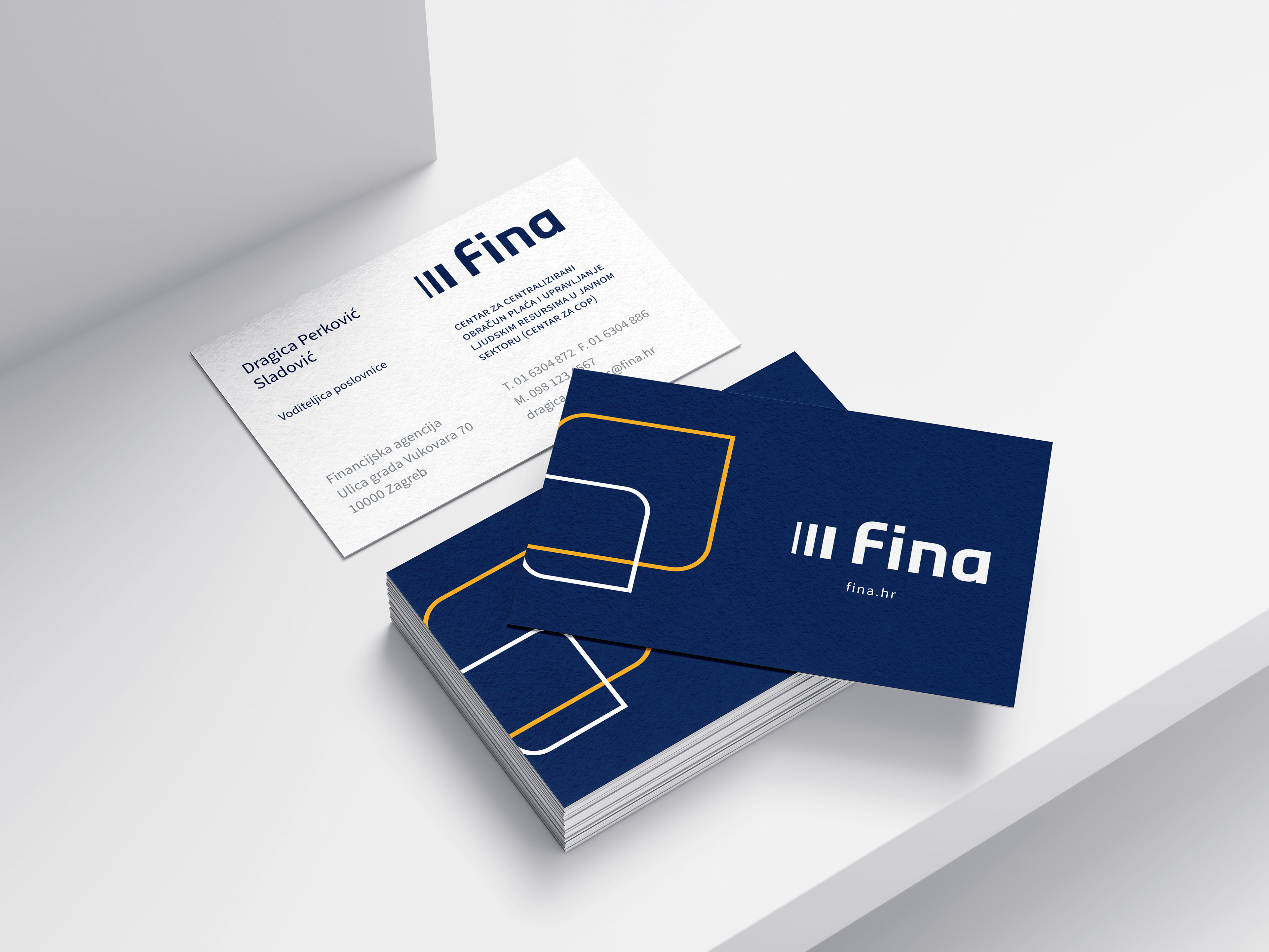
The logo was carefully rebuilt, not replaced. Working with typographer Hrvoje Živčić, we corrected width, spacing, and letterforms, resolving the long-standing issues while fully preserving recognition.
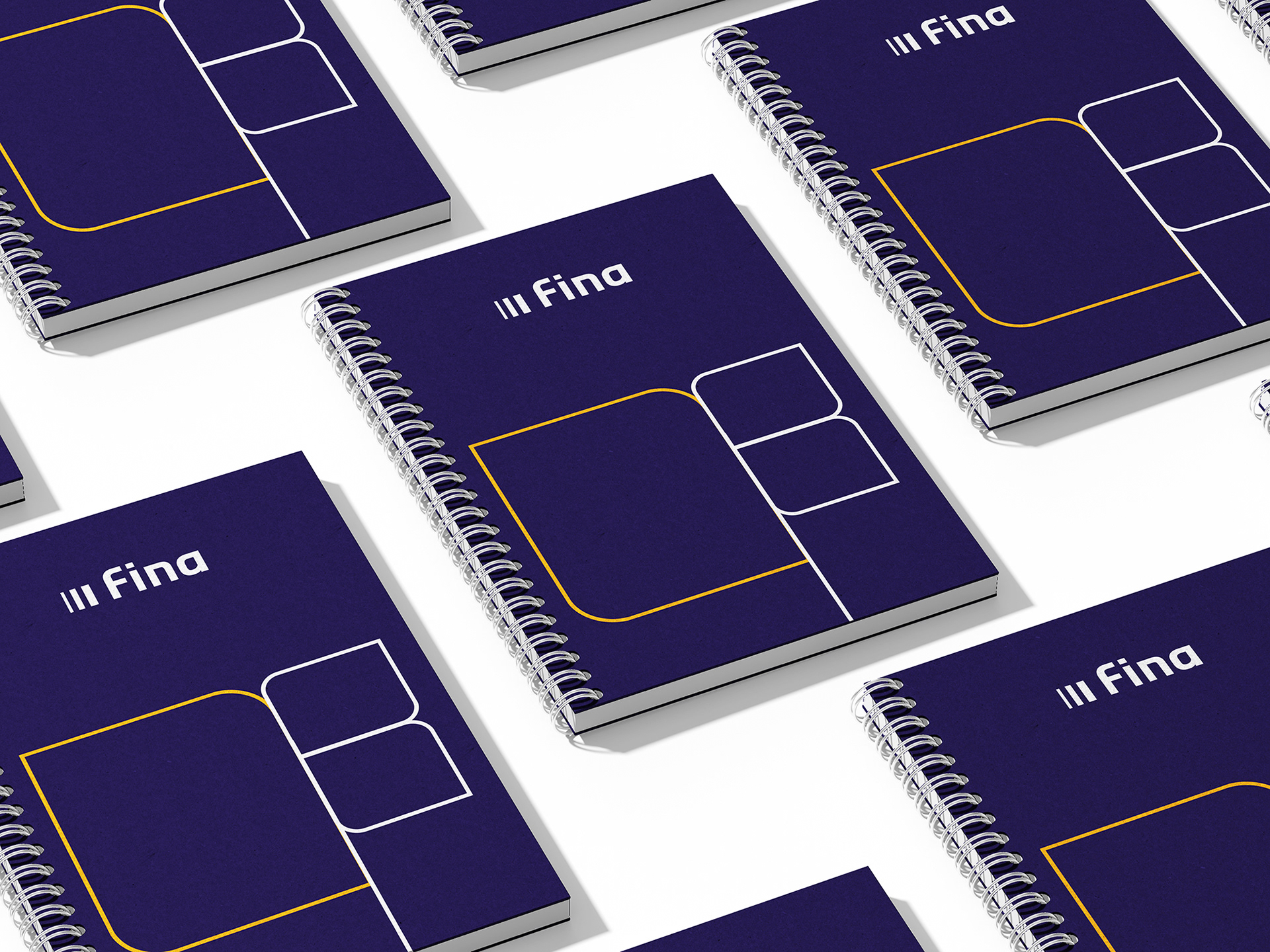
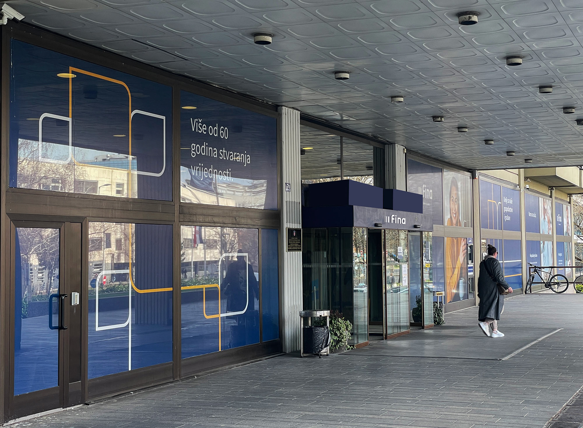
With the logo stabilised, the wider identity was reduced to a clean, unified system: controlled typography, a refined palette, and a strict grid that aligns all services under one structure. The result is a visual language that works seamlessly across interfaces, documents, signage and high-density digital environments.
The Results
The refined logo scales cleanly, reads better, and fits modern digital use without losing its original character.
The updated system brings order to FINA’s communication. Services that once looked unrelated now feel like part of one organisation, strengthening trust and brand recognition. Internally, teams report easier implementation and fewer inconsistencies. Externally, FINA now presents itself with the clarity and confidence expected from a national leader in digital and financial services.


Art direction/Design: Igor Manasteriotti, Manasteriotti DS
Typography: Hrvoje Živčić
Typography: Hrvoje Živčić
Brand strategy: Stipan Rimac, Trawelt
Digital: Netgen
Digital: Netgen