The Flying Dish Festival 2024
Visual Identity
The Concept
The Flying Dish was imagined as a melting pot of cultures, bridging the local and the global through a shared love of food and music. It is a place where people connect around the table — exchanging flavors, stories, and laughter with both new and old friends. By fostering an open and welcoming festival culture, The Flying Dish creates a sense of belonging built on curiosity, joy, and togetherness.
The Solution
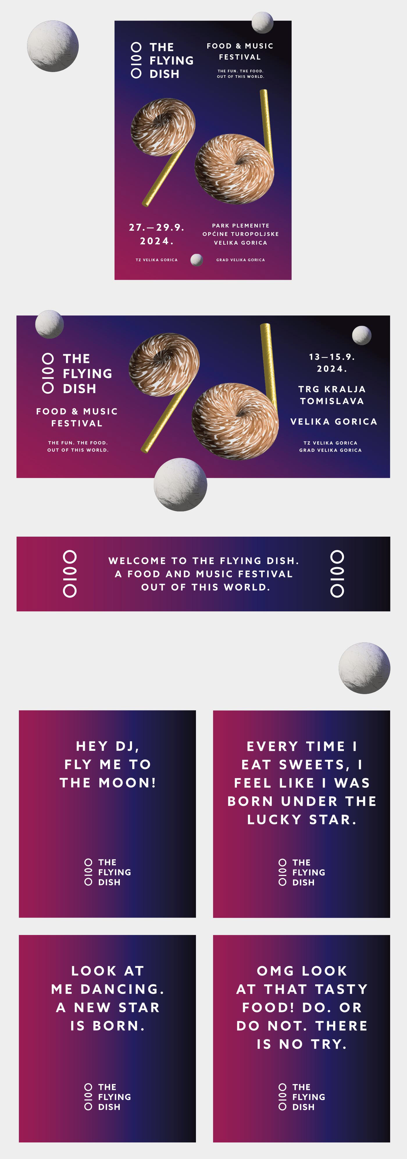
Brand consultant Stipan Rimac set up the the overarching brand theme as space,
from which the brand narrative, name, slogan, and visual identity were derived.
from which the brand narrative, name, slogan, and visual identity were derived.
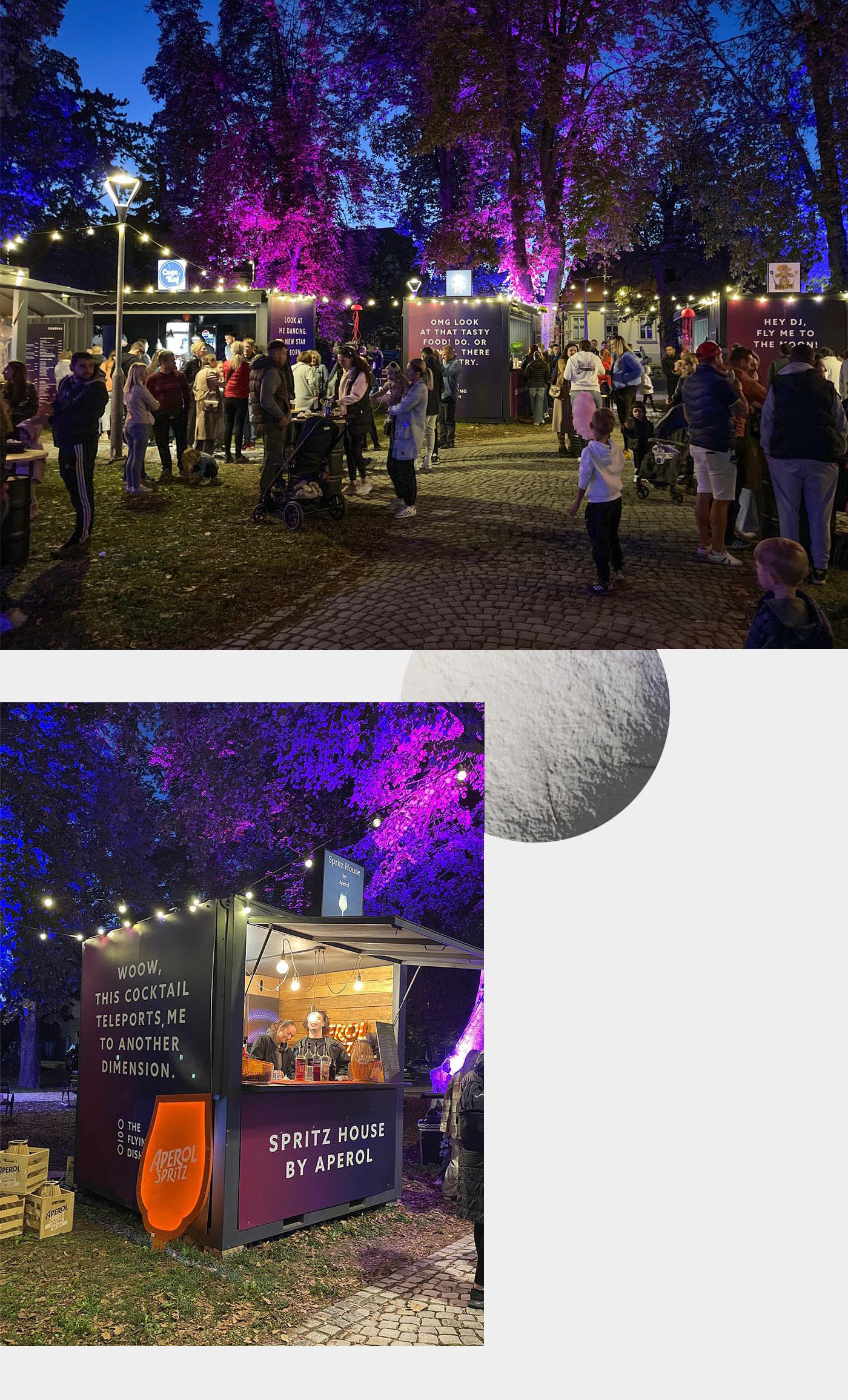
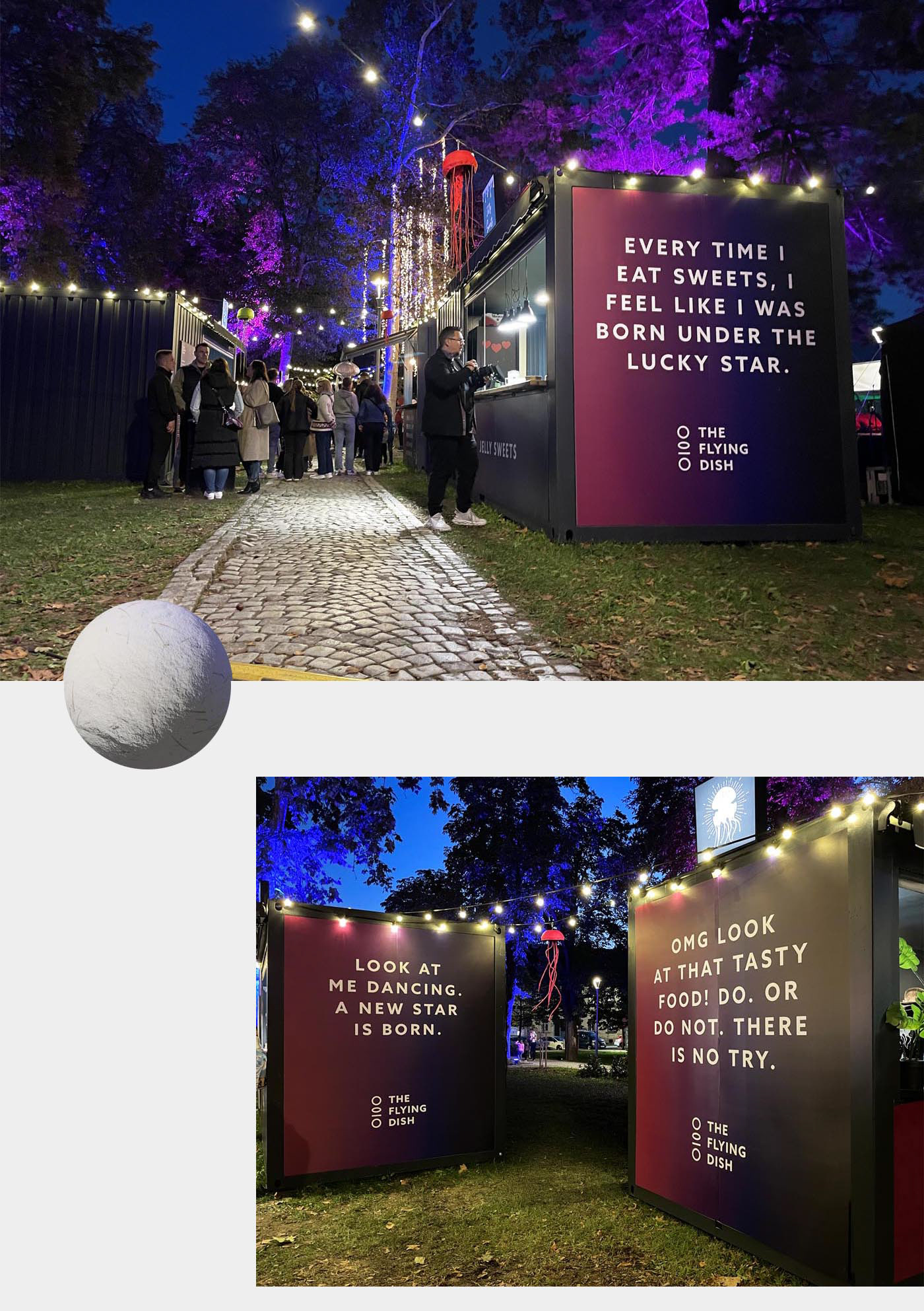
We designed the visuals as a space-like gradient background with 3D shapes that resemble donuts (food) and apple airpods (music). Elements are floating in space, with white moons around it. The logo served as a brand identifier while the system of colors, shapes, and typography was used for the backdrop of information.
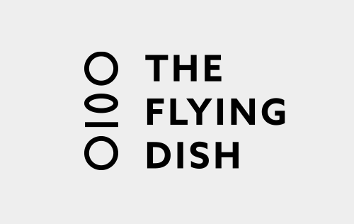
The festival logo became a simple black and white symbol that depicts a frame by frame act of a dinner plate flipping in the air.
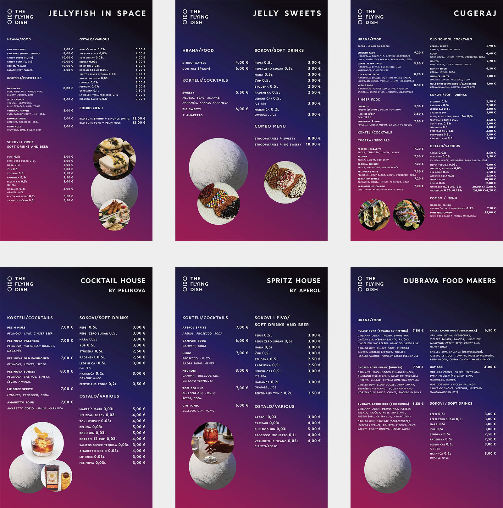
The visual system extended into the space of the festival, with all containers branded with gradient backgrounds, large brand messages and clear food menus.
The Results
The Flying Dish quickly gained momentum and returned with a successful second edition. The concept sparked strong interest among visitors and achieved over 1 million digital impressions within its first year. Audience response was overwhelmingly positive, with attendees expressing high excitement and strong emotional connection to both the festival concept and its visual identity, reinforcing the brand’s relevance and appeal across physical and digital touchpoints.
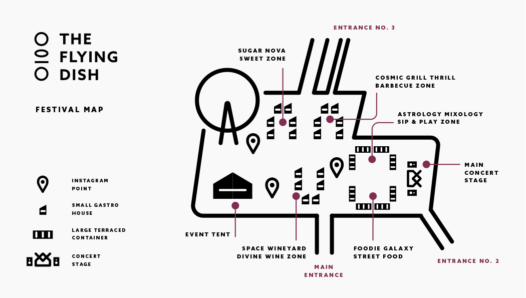
Festival Map
Visualisation
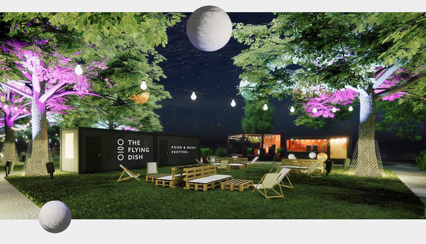
The Park
Art direction/Design: Igor Manasteriotti, Manasteriotti DS
Brand Consultant: Stipan Rimac, Trawelt
Brand Consultant: Stipan Rimac, Trawelt