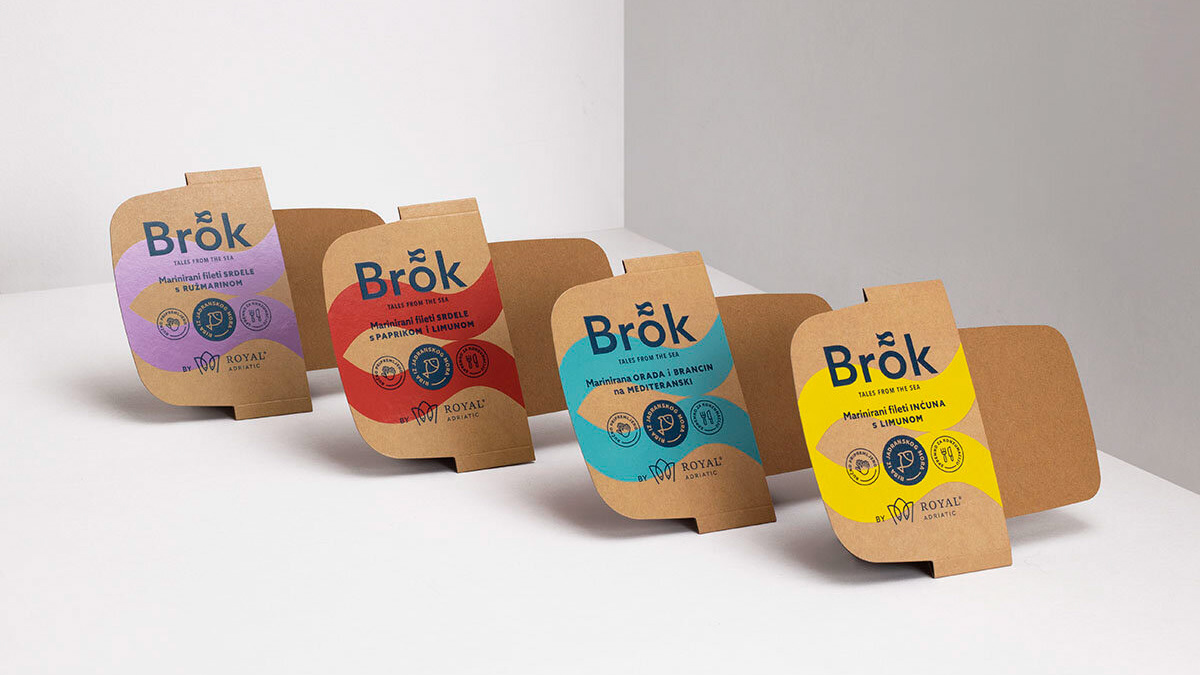
Autoto
Visual Identity
The Problem
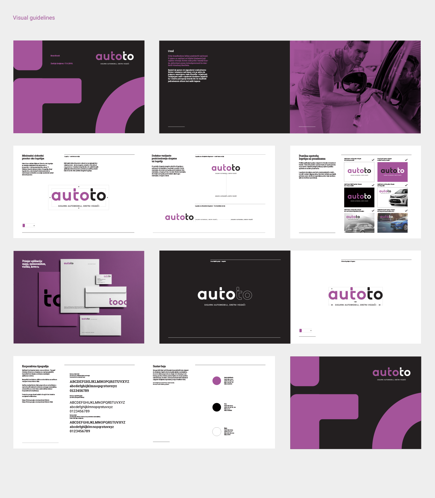
Autoto operated in a market where trust is the main concern for anyone buying a used car. Even though the company offered checked and reliable vehicles, its visual identity did not show that clearly. The brand looked generic, lacked a strong point of view, and could not differentiate itself from other dealerships. Autoto needed an identity that would communicate safety, clarity and a straightforward buying experience.
The Solution
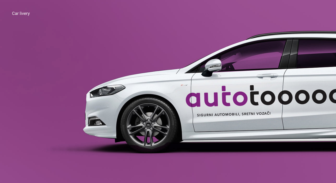
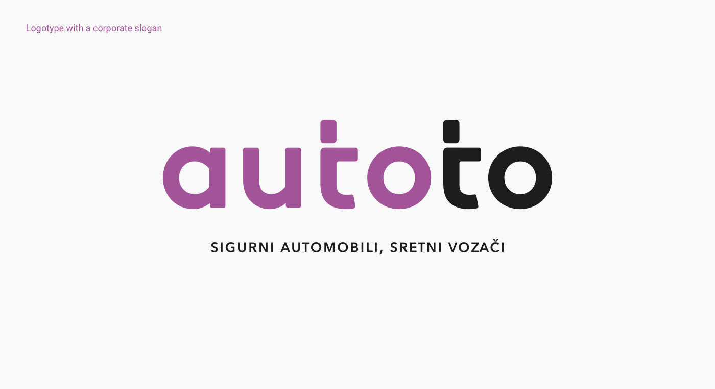
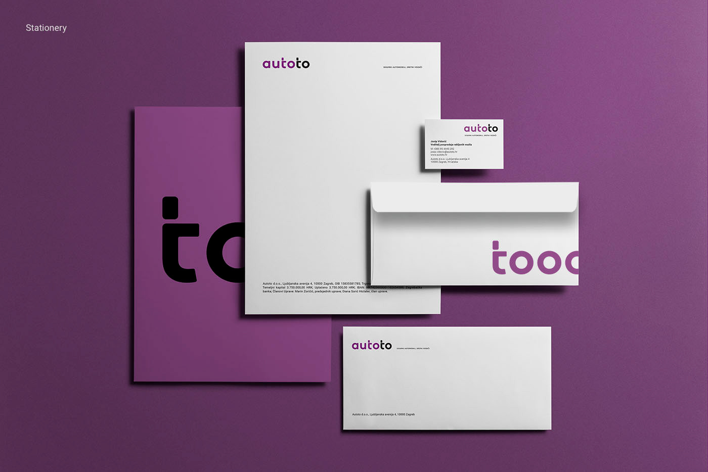
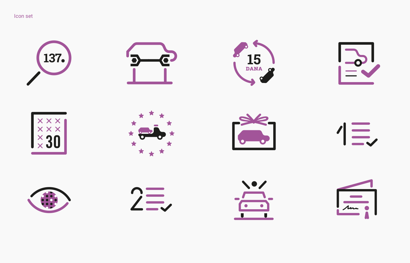
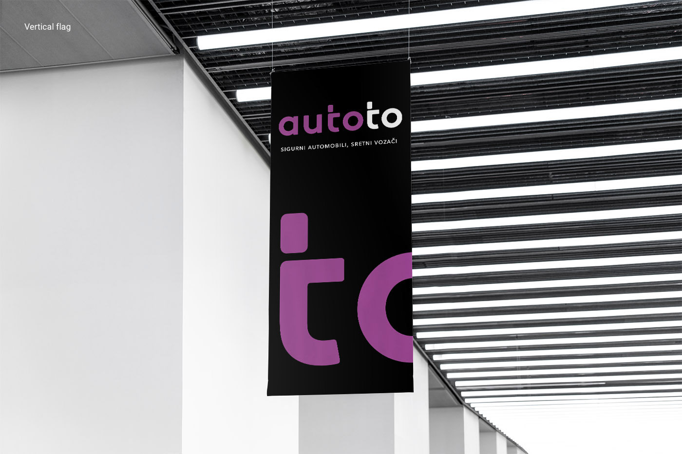
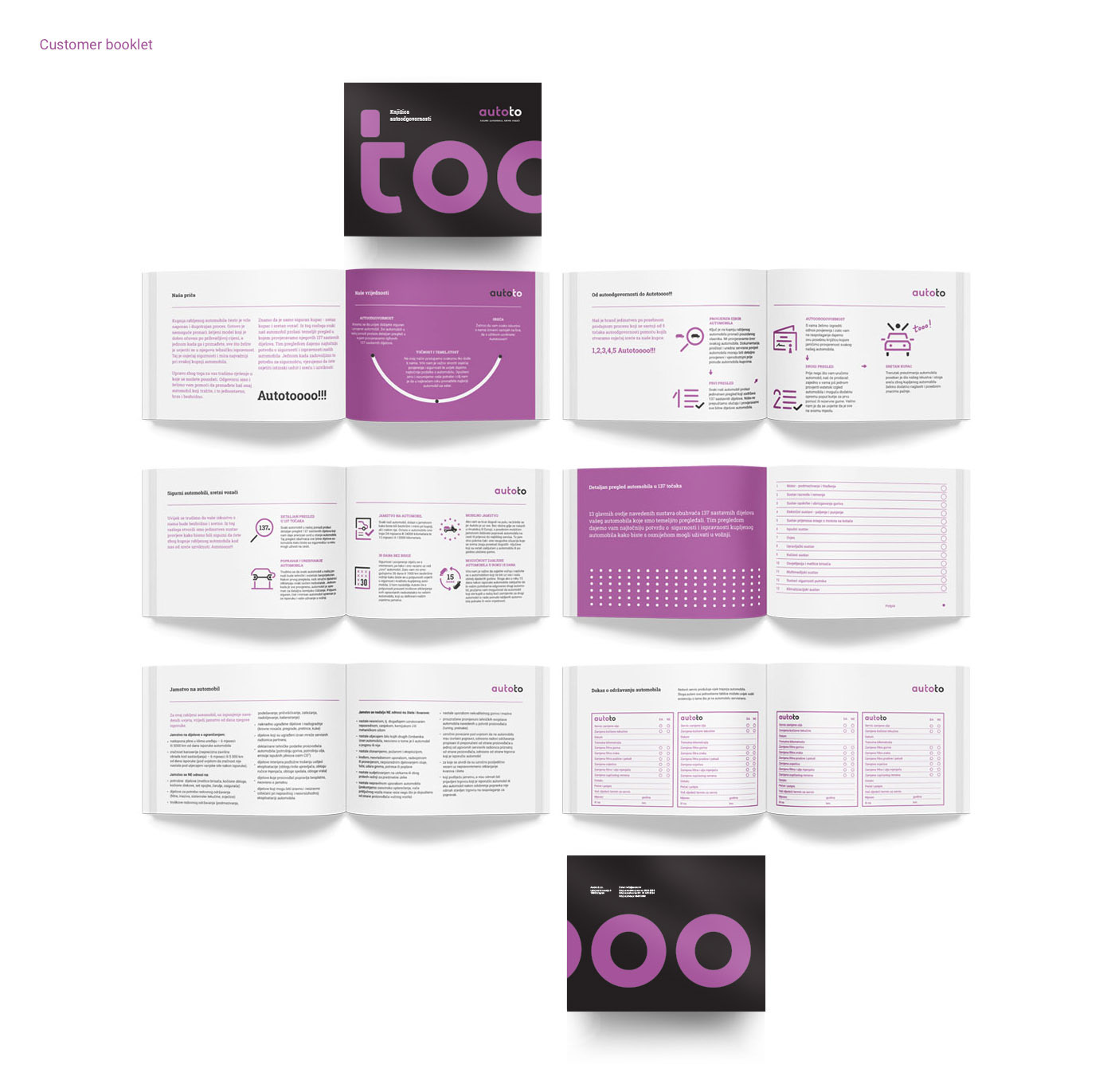
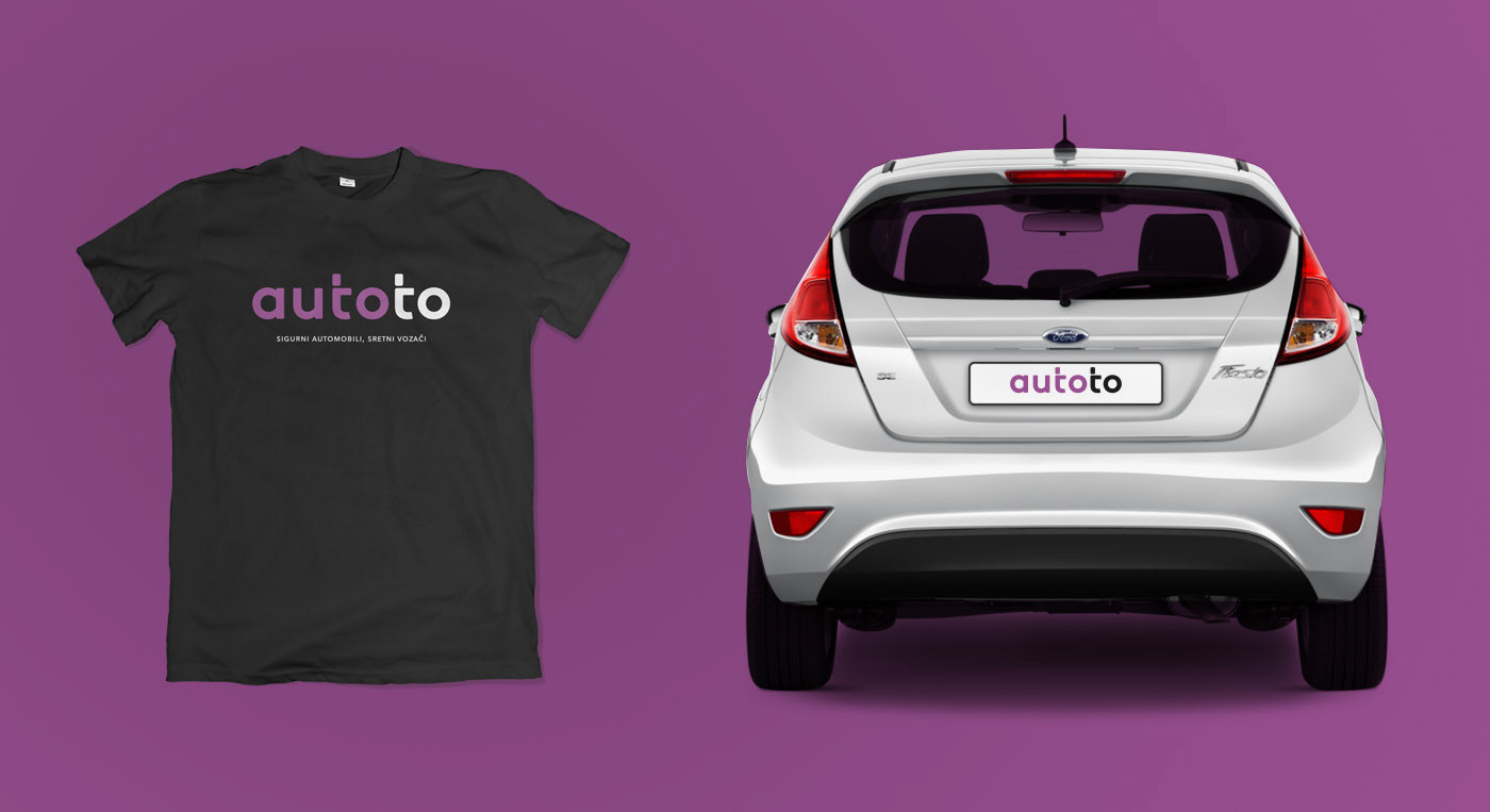
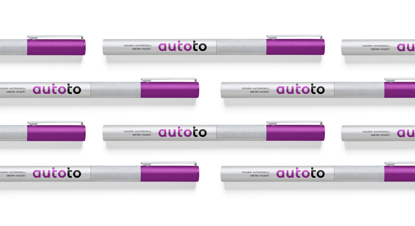
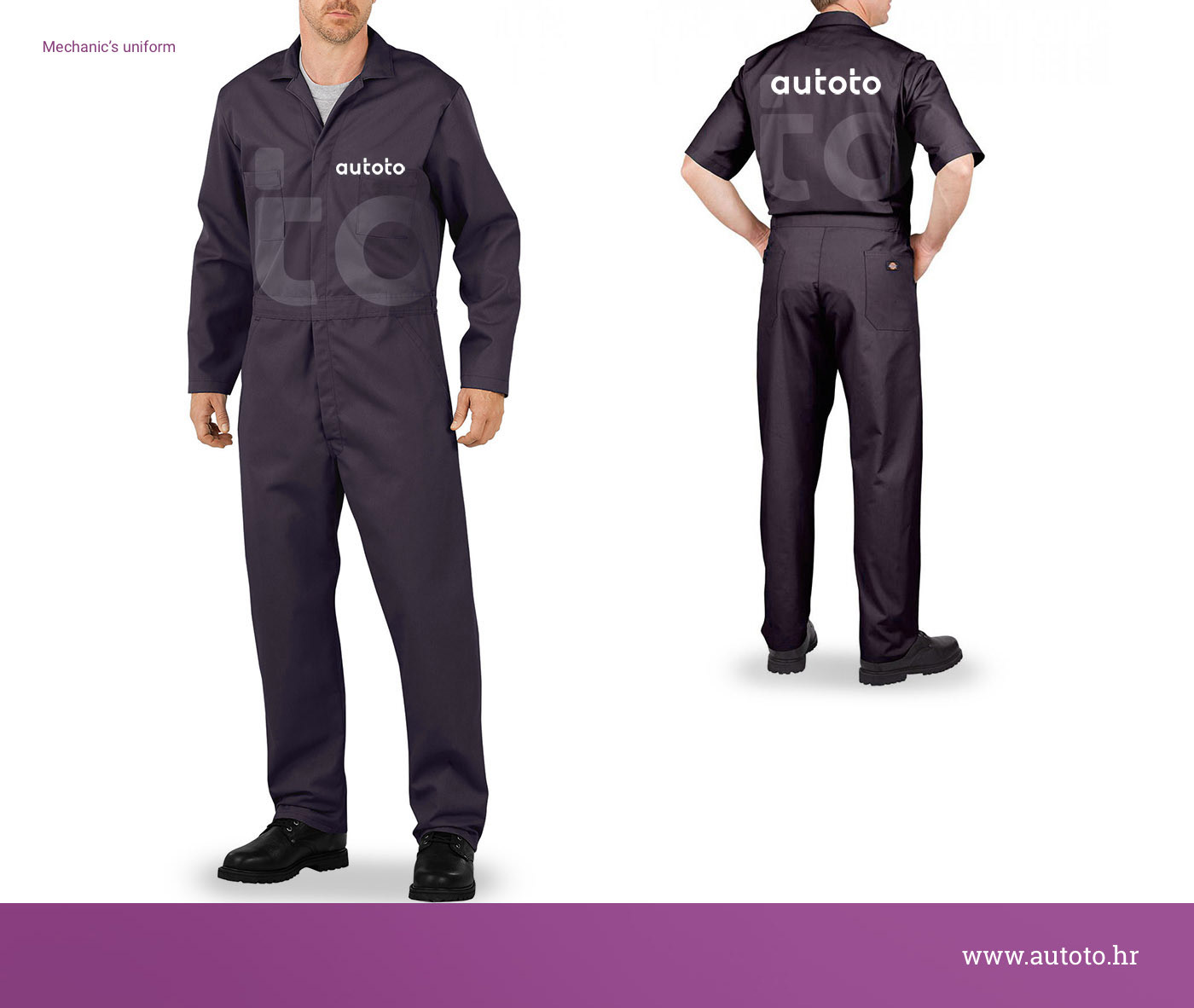
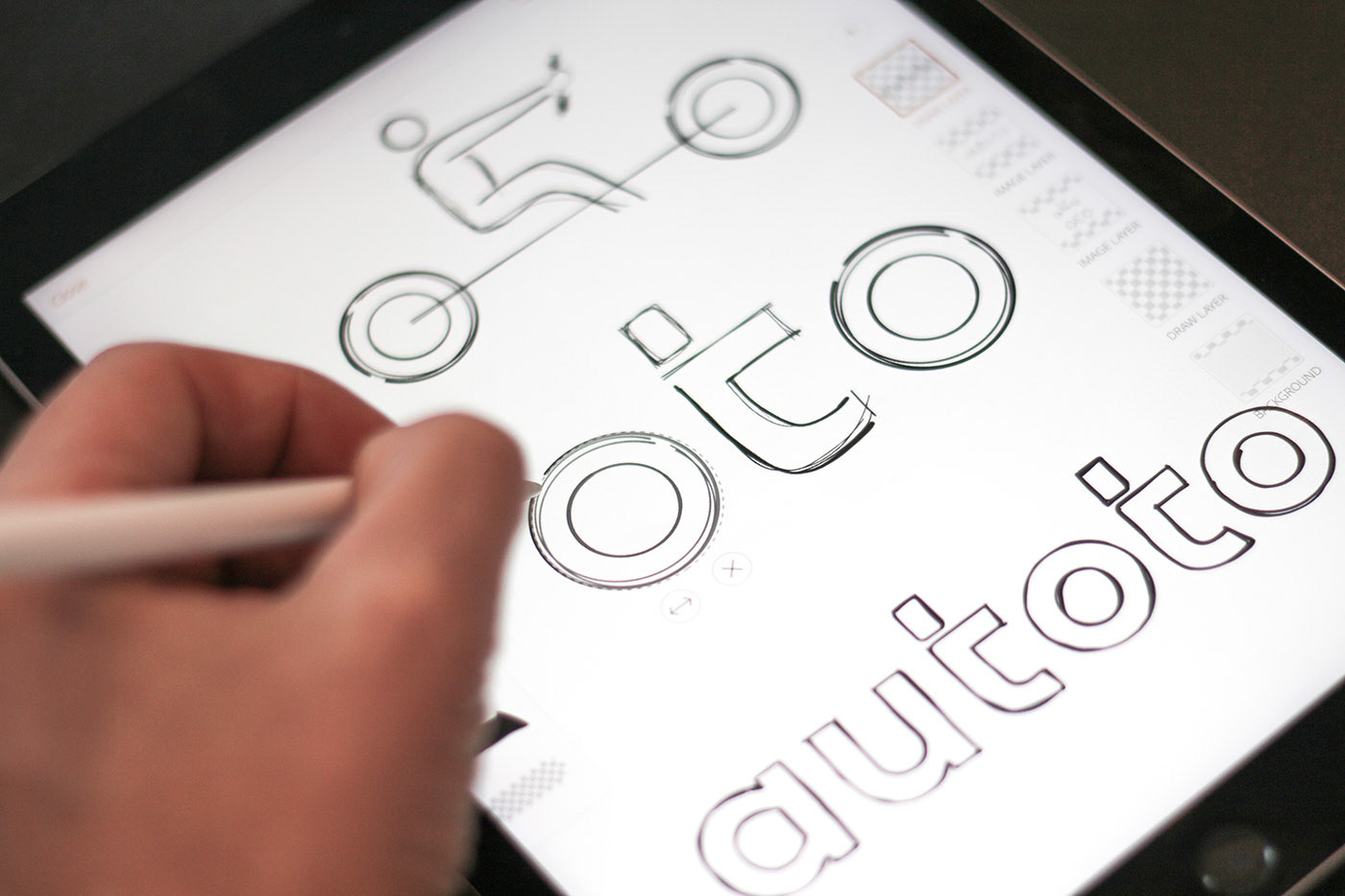
The new identity is built around a simple idea: focus on the driver. The two “t” letters form a pair of figures behind the wheel, while the “o” shapes read as wheels. This creates a direct, intuitive link to driving and to satisfied customers. The rest of the system follows the same logic —
clear typography, simple layouts and consistent use across all materials.
The goal was to present Autoto as a company that is easy to trust and easy to understand.
clear typography, simple layouts and consistent use across all materials.
The goal was to present Autoto as a company that is easy to trust and easy to understand.
The Results
The redesigned identity gives Autoto a clear position in the market. It looks confident, recognisable and reliable. Customers understand the brand more quickly, and the overall impression matches the way Autoto actually works: transparent process, clean cars and no hidden steps. The new identity supports higher expectations from buyers and gives the company a
stronger foundation for growth.
stronger foundation for growth.
Agency: Fabular
Brand Strategy & Creative Director: Anja Bauer Minkara
Senior Brand Consultant: Petra Despot Domljanović
Brand Consultant: Stipan Rimac
Copywriter: Anja Bauer Minkara
Brand Implementor: Jelena Mezga
Art Direction/Design: Igor Manasteriotti
Brand Strategy & Creative Director: Anja Bauer Minkara
Senior Brand Consultant: Petra Despot Domljanović
Brand Consultant: Stipan Rimac
Copywriter: Anja Bauer Minkara
Brand Implementor: Jelena Mezga
Art Direction/Design: Igor Manasteriotti