Corvus Pay
Visual Identity Redesign
The Problem
CorvusPay’s old logo and visual style looked dated and rigid, and no longer reflected the quality or scale of the service. The brand lacked personality and blended into the crowd of similar fintech companies. Because there was no unified visual system, the website, product screens, and marketing materials all looked disconnected from one another. As a result, the brand failed to clearly express simple but important ideas such as ease of use, freedom, and reliability.
The Solution
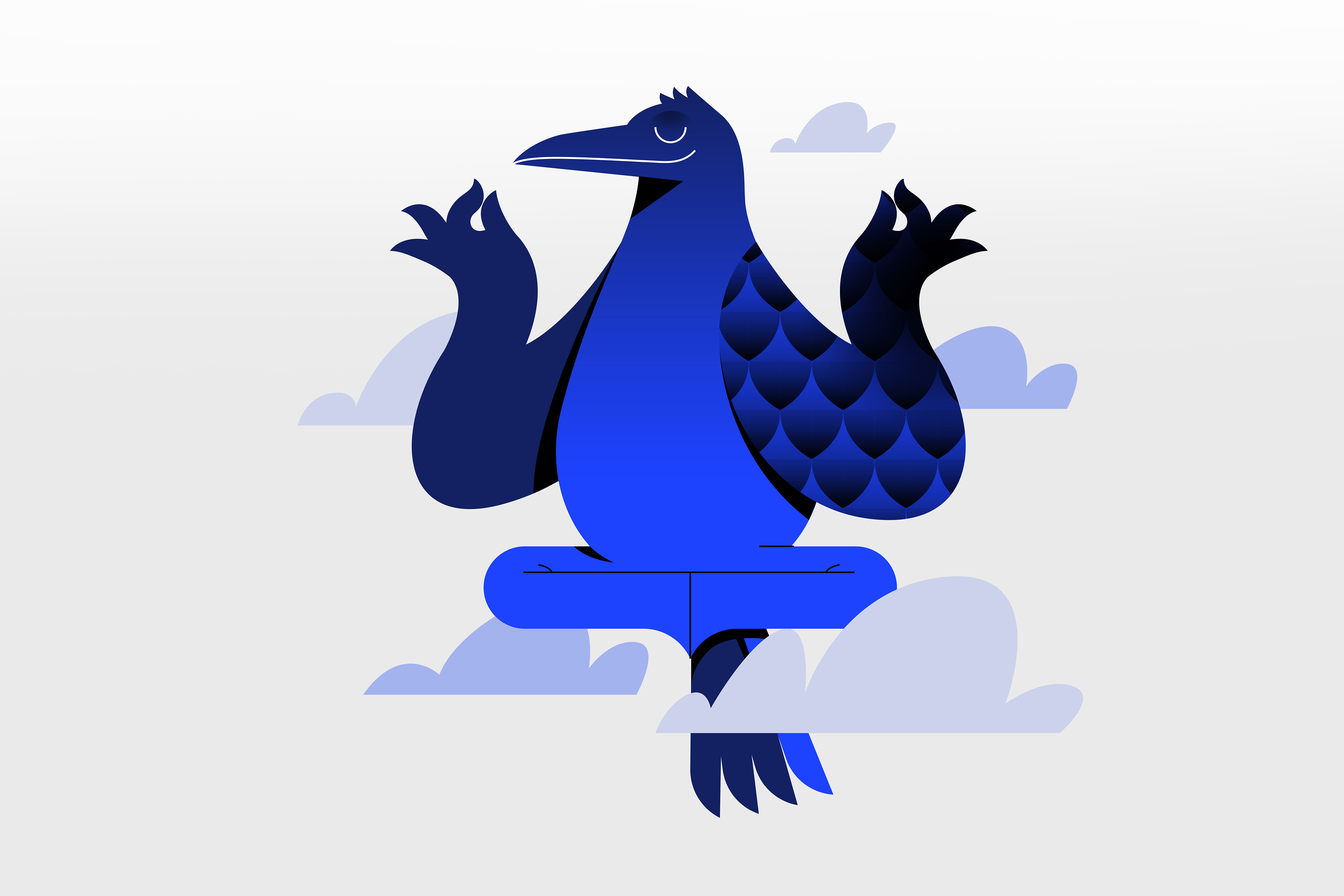
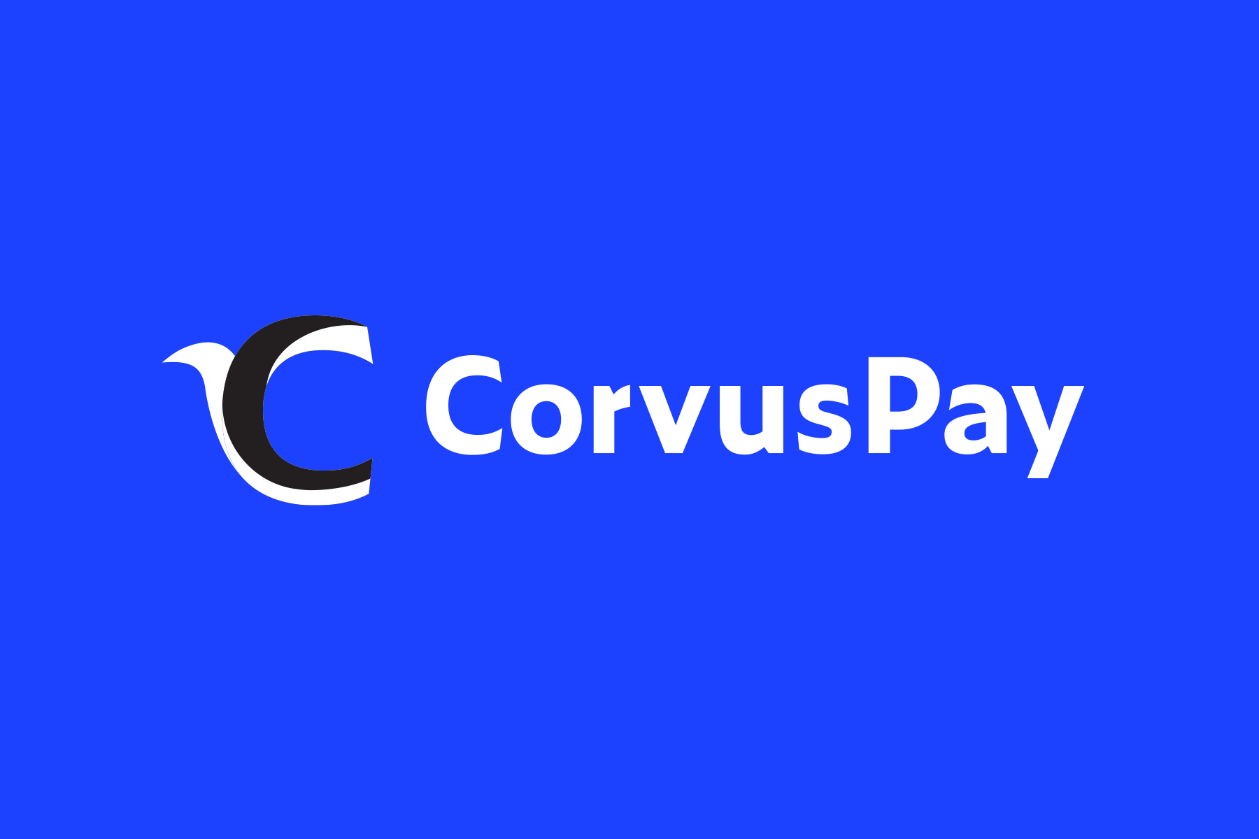
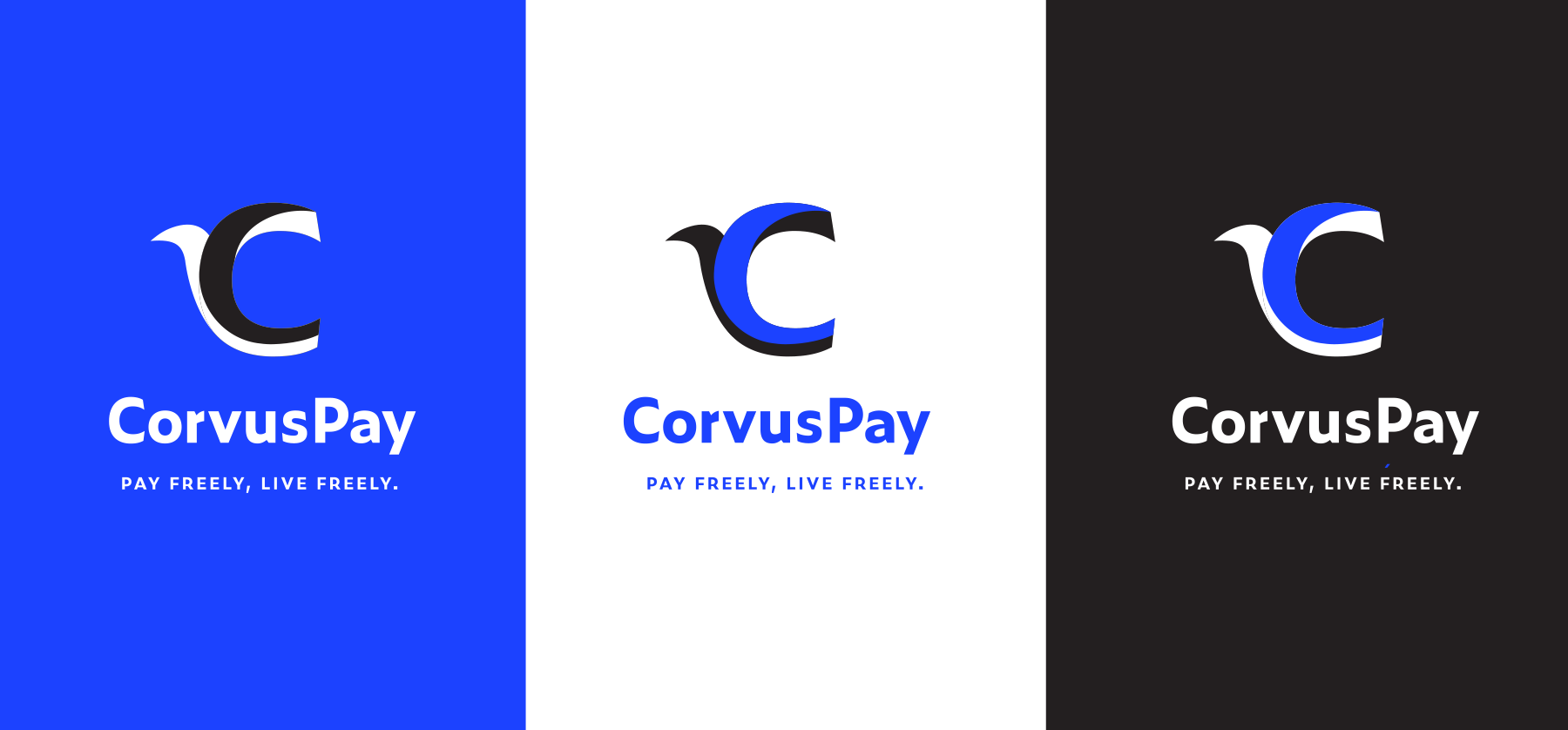
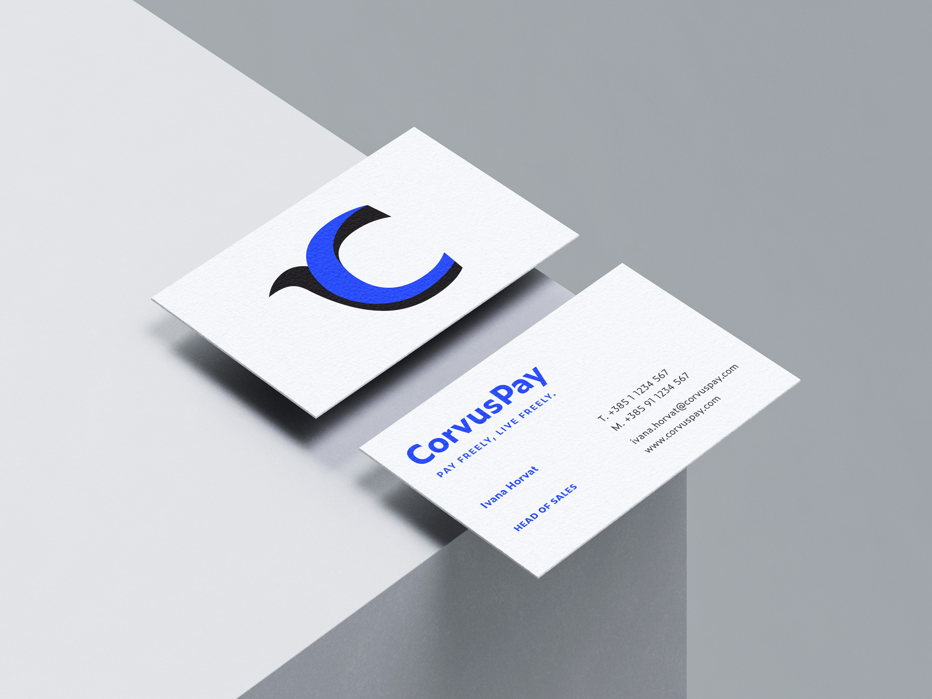
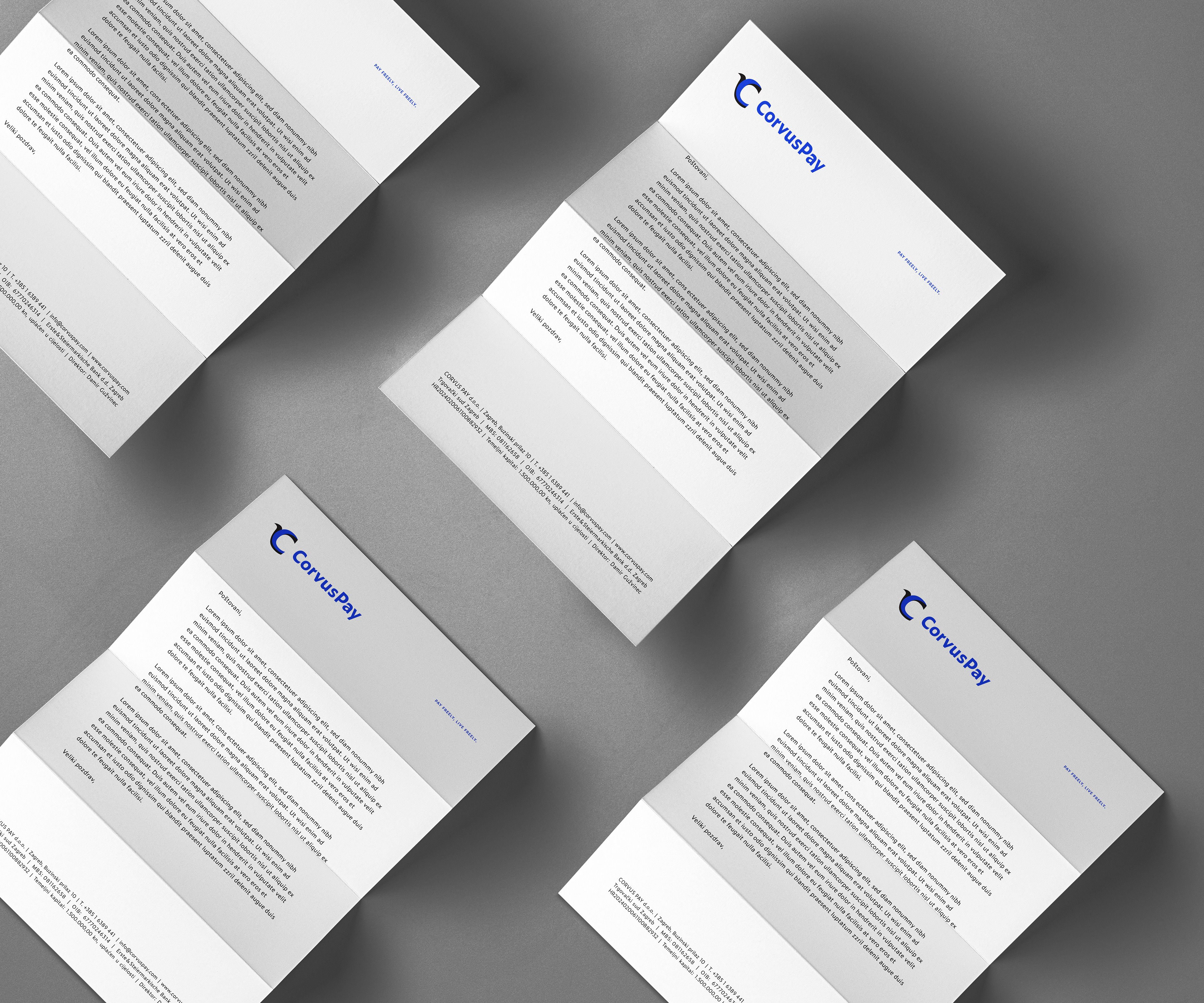
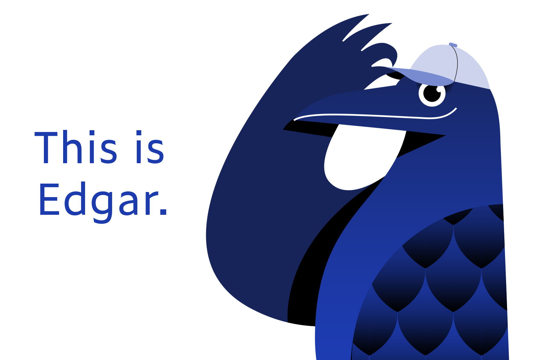
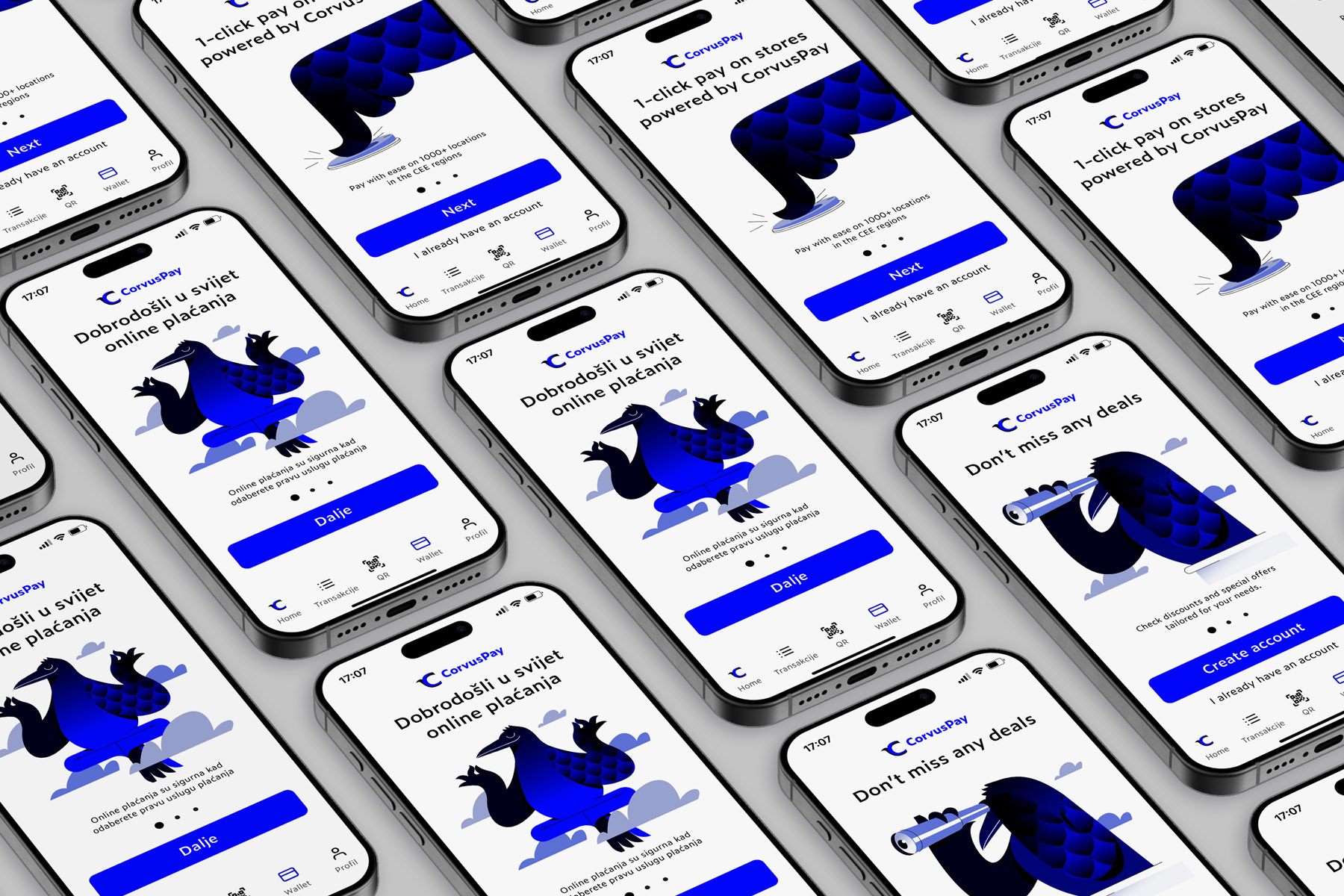
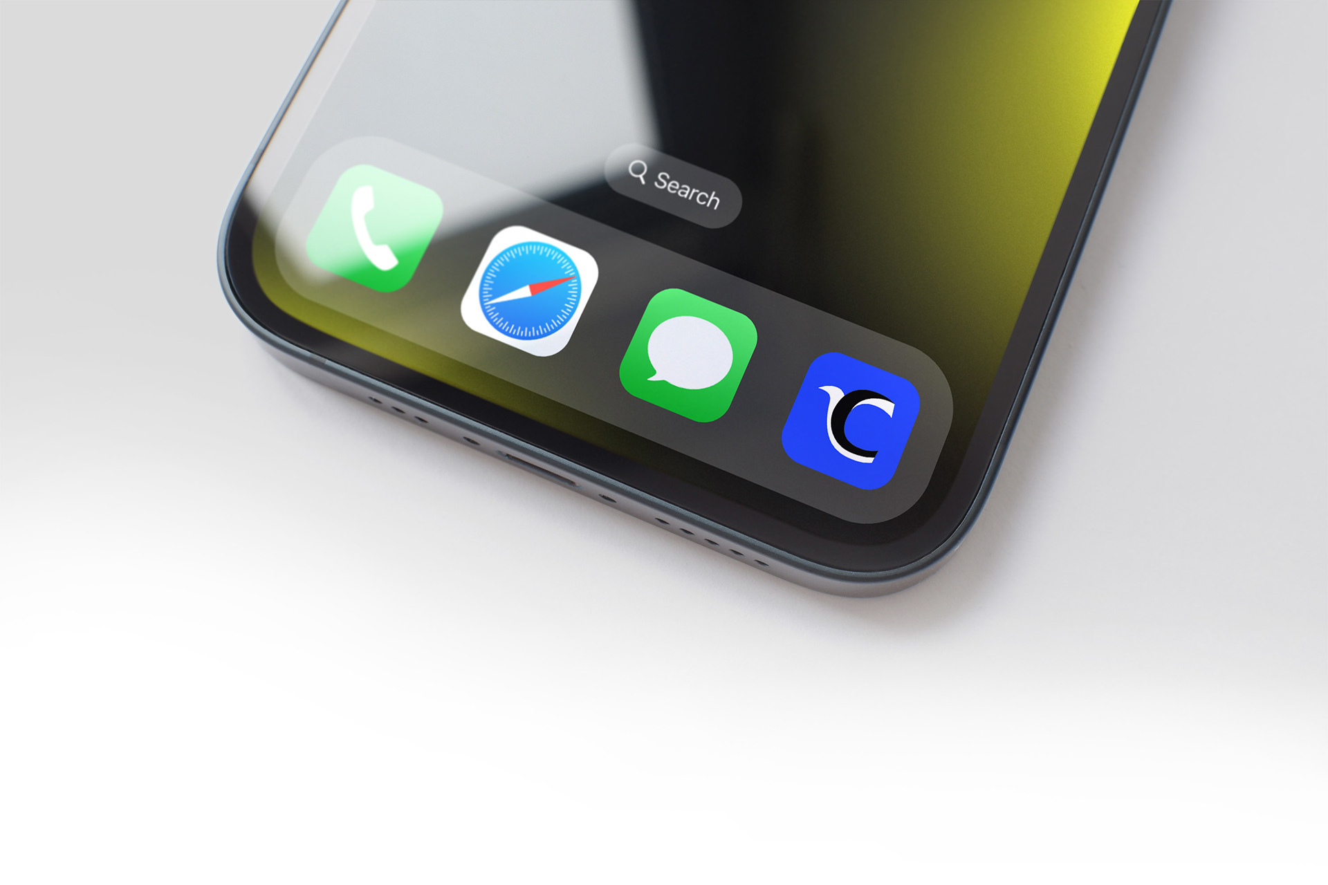
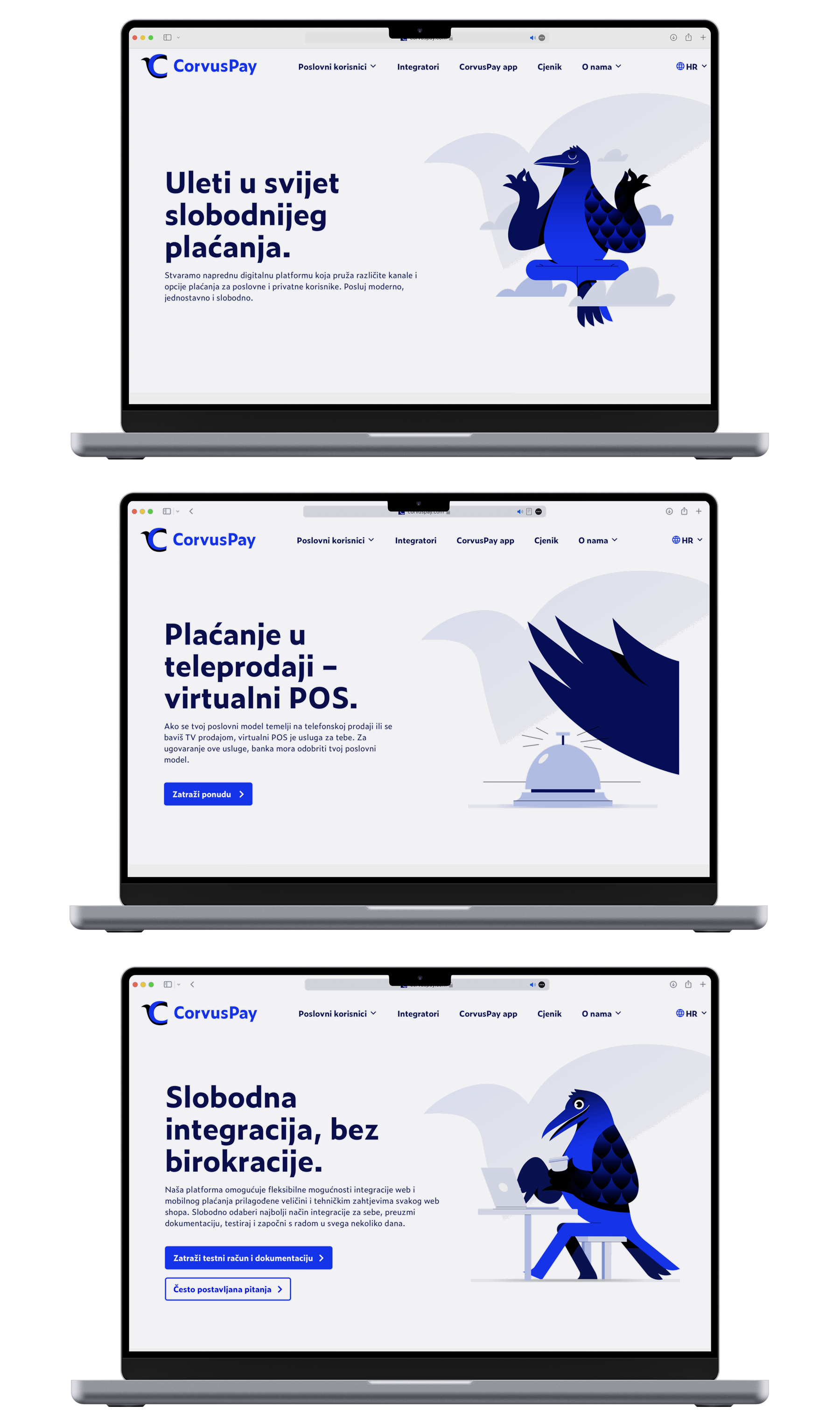
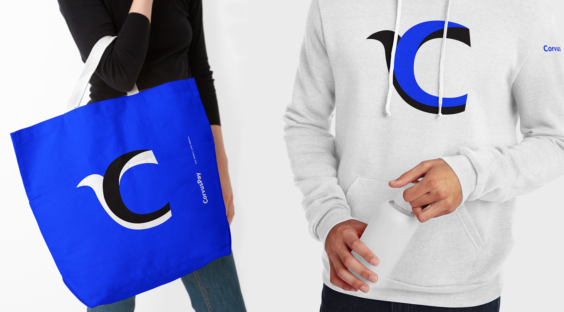
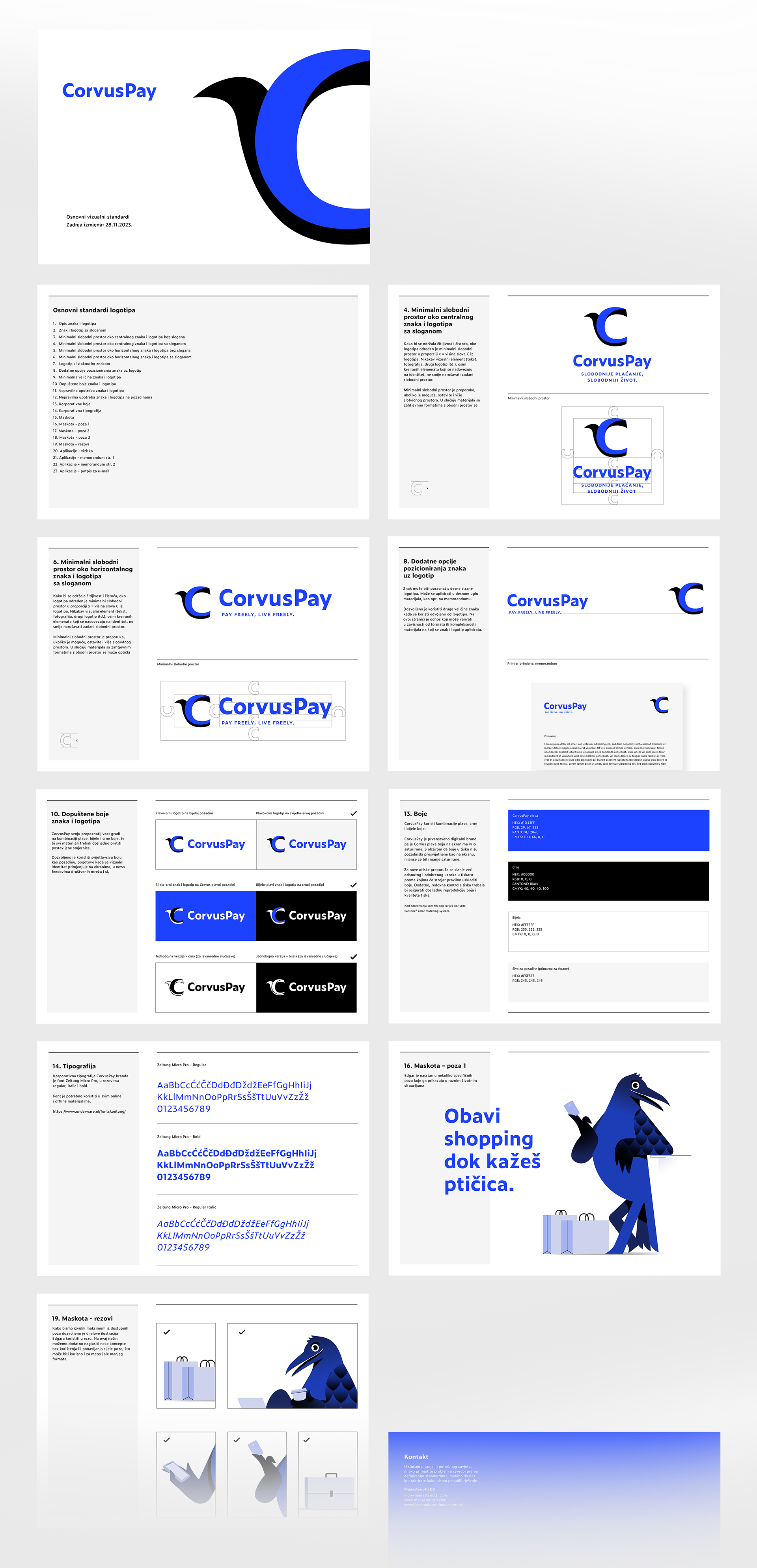
The redesign introduced a clear concept rooted in freedom, using the raven as a simple, direct symbol for that idea. A new mascot, Edgar, was created to bring warmth and character into the brand, making communication more friendly and relatable. The identity was rebuilt from the ground up: a new logo, cleaner colors, a consistent illustration style, and well-defined rules for layout and application. The result is a flexible system that works smoothly across digital interfaces, printed communication, and marketing materials, giving the brand a modern and coherent presence.
The Results
The new identity gives CorvusPay a strong and recognizable look that stands out clearly in the fintech space. Edgar adds a human tone that makes the brand easier to connect with, while the unified system helps the internal team create materials quickly and consistently. The redesign aligns CorvusPay’s visual presence with the reality of its product: a reliable, modern, easy-to-use payment platform. The shift has brought noticeably more positive reactions from users and partners and gives the company a visual foundation that supports long-term growth.

This project was a wonderful collaboration between Manasteriotti DS, Trawelt and Netgen.
Art direction: Igor Manasteriotti, Manasteriotti DS
Brand strategy: Stipan Rimac, Trawelt
Digital: Netgen
Illustration: Damir Mazinjanin
Brand strategy: Stipan Rimac, Trawelt
Digital: Netgen
Illustration: Damir Mazinjanin