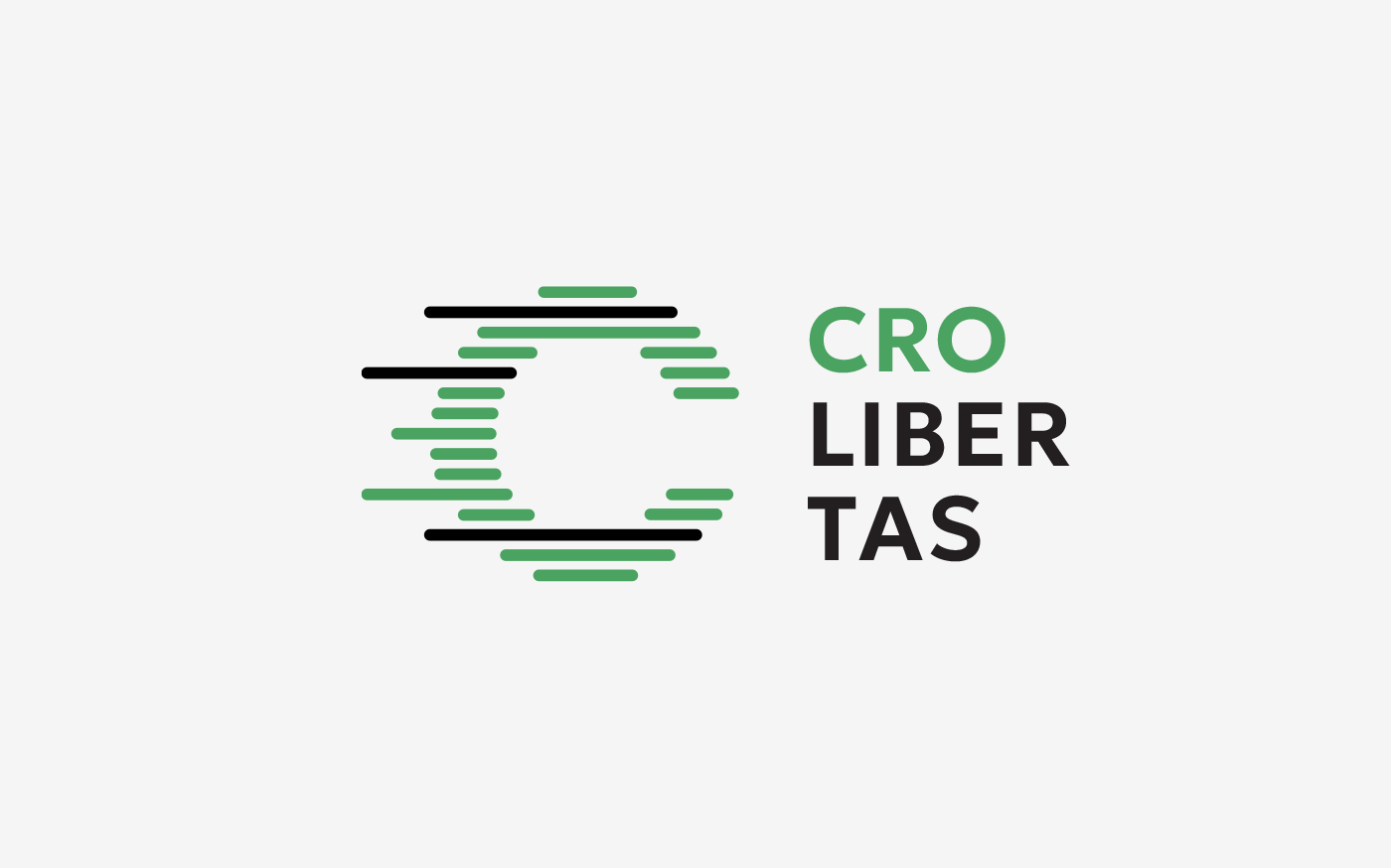
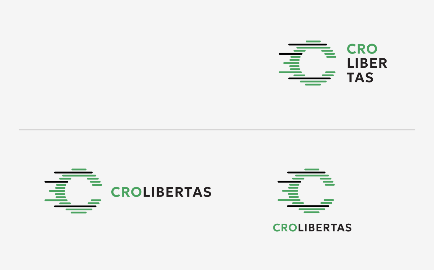
Crolibertas
Visual Identity Proposal
Second prize
Hrvatske autoceste and Croatian designers society conducted a public competition for the design of the visual identity of the new toll collection system CROLIBERTAS.
Manasteriotti DS was awarded the second prize for the proposal.
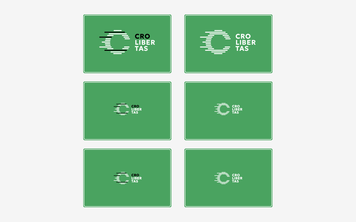
The logo shows the letter C in motion, using a sleek line effect to suggest speed. It communicates the key benefit of Crolibertas — drivers can keep moving without stopping.
The design is highly visible and works well even at smaller sizes. As the logo scales down, the lines become denser but the C remains clear, making it ideal for traffic signage. The one-color version keeps all the information intact.
The logo can be used in its original form, or the lines can be extended to adapt to different formats while reinforcing the idea of speed.
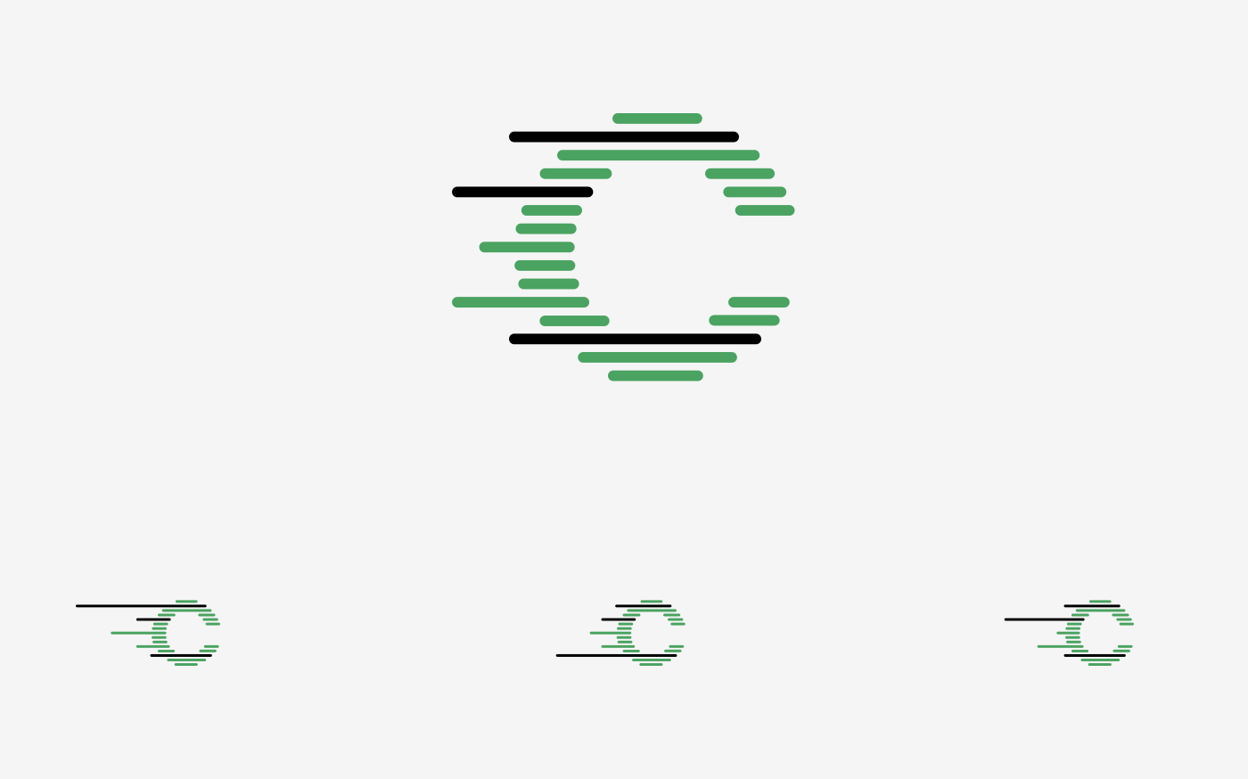
Display of the three main proportions; additional variations for special formats will be defined in the brand guidelines.

Color positive/negative
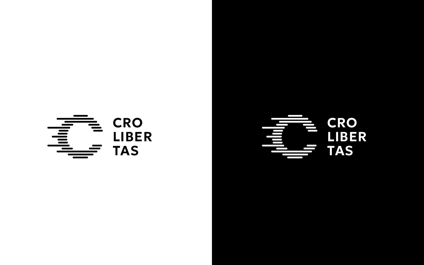
Black and white positive/negative
Display of the three main proportions; additional variations for special formats will be defined in the brand guidelines.
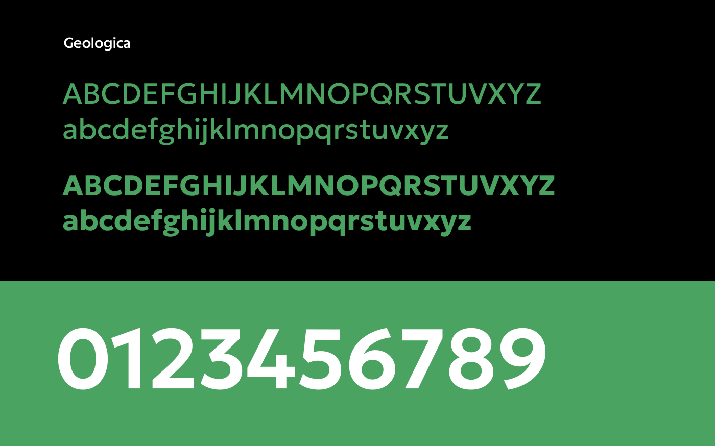
The identity uses a modern open-source font called Geologica. It is geometric, stable, and highly legible.
Google Fonts are numerous - they are free and legally available, optimized for print, web, and mobile devices and easy to implement
Google Fonts are numerous - they are free and legally available, optimized for print, web, and mobile devices and easy to implement
Logo can be applied to traffic signage in a black-and-white version, or, for maximum clarity, in a single-color white version.
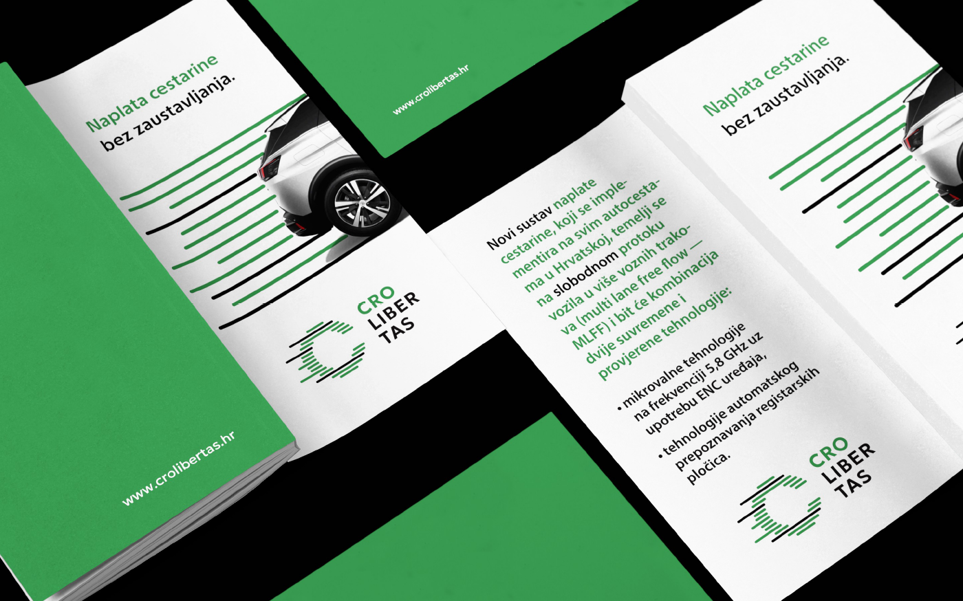
Brochures
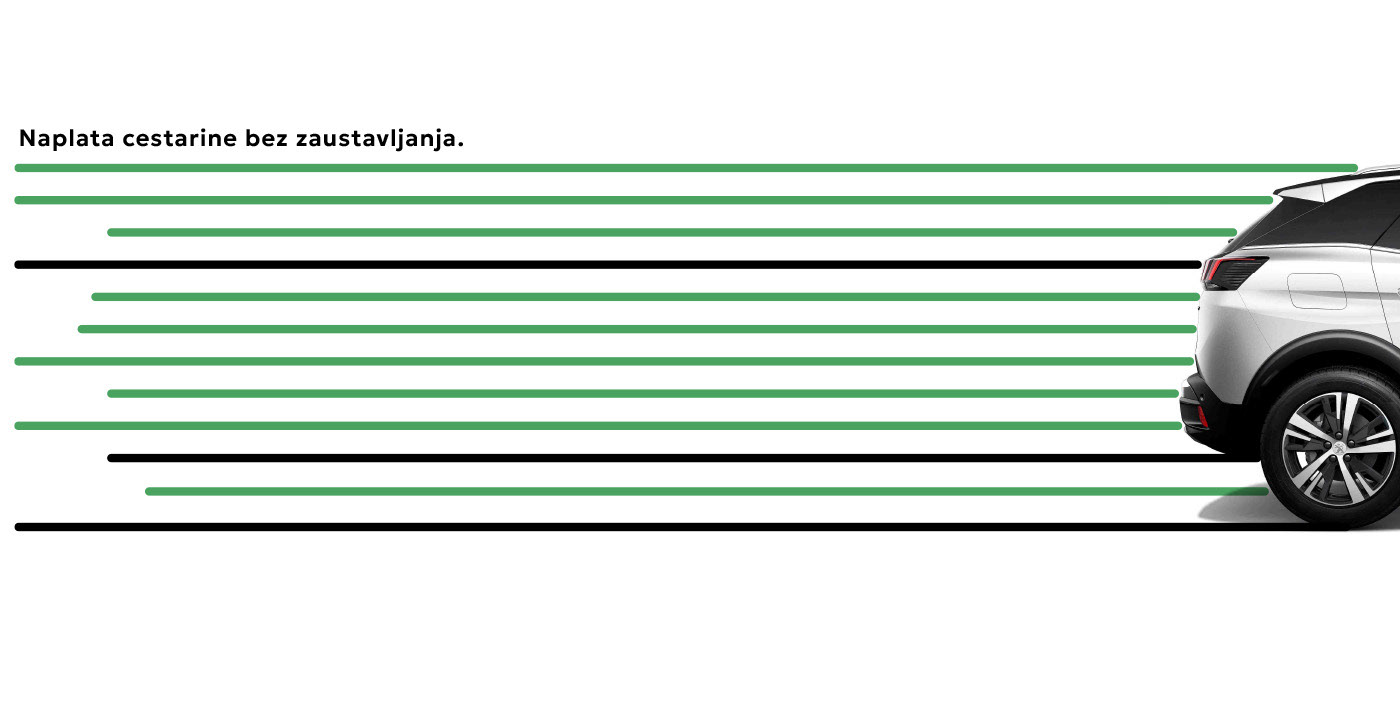
The lines from the logo can be developed into recognizable visuals for use in promotional materials, built around the concept:
“The shortest distance between two points is a straight line.”
This phrase is often used literally in geometry, but also metaphorically – suggesting that the simplest solution is often the best. In our case, the shortest distance refers to a journey with the fewest stops and slowdowns.
Note: the headline is only a placeholder text for visualization purposes.
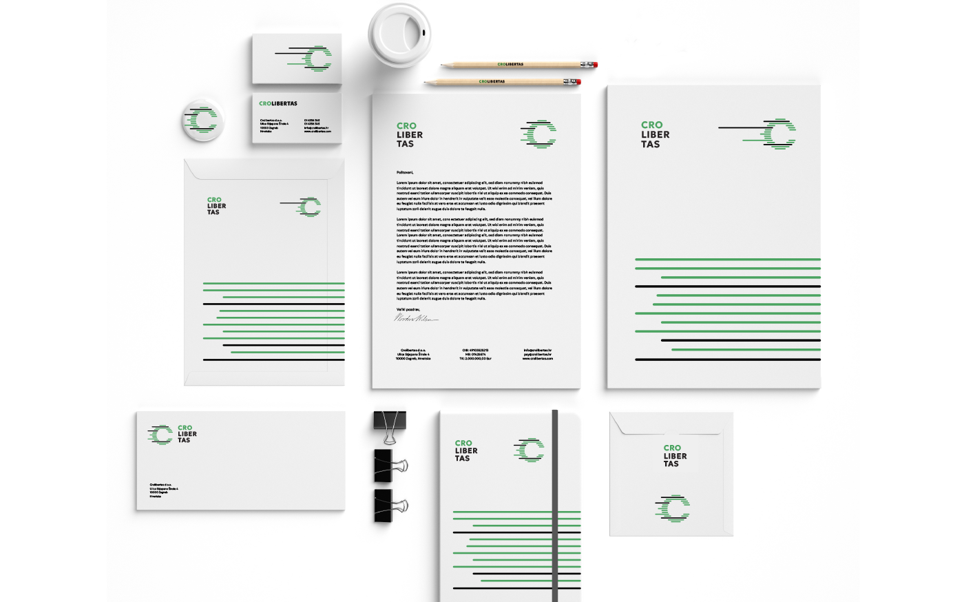
Stationery

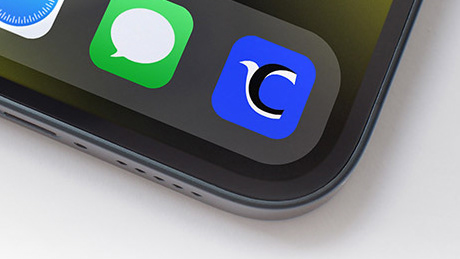
Smartphone icon
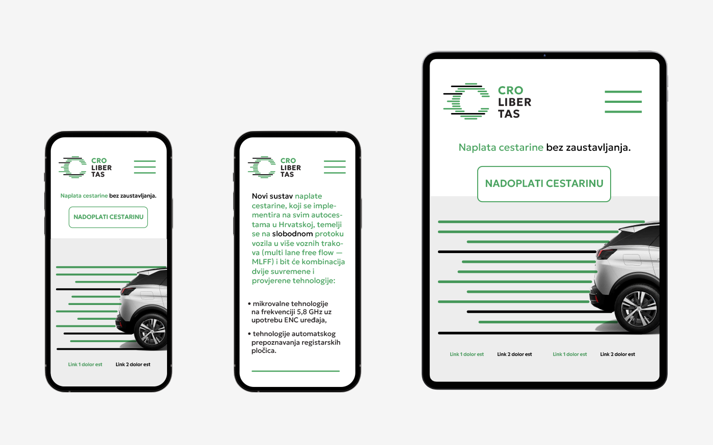
Digital
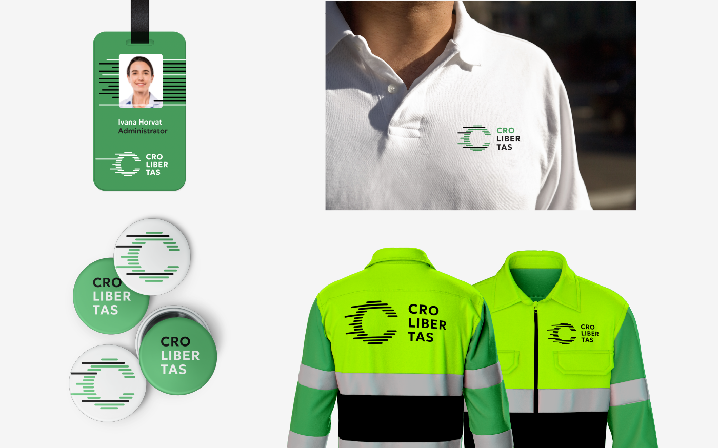
Application on various relevant materials
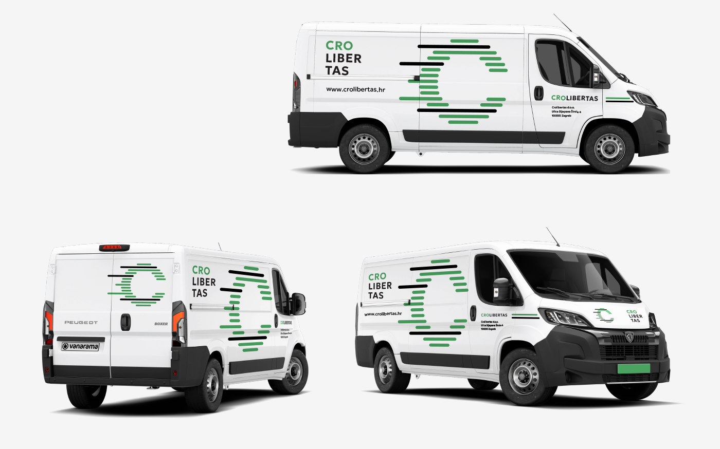
The visual identity can be applied effectively onto company livery, as it easily adapts to the irregular surfaces of vehicles.
Design: Igor Manasteriotti, Manasteriotti DS